The Ultimate Guide to Choosing the Perfect Color Palette
Hey there, color enthusiasts! Whether you’re a designer, an artist, or just someone looking to spruce up your living space, choosing the right color palette can be a game-changer. Colors have the power to evoke emotions, set moods, and even influence decisions. But with so many hues, shades, and tones out there, how do you pick the perfect palette? Fear not! This ultimate guide is here to help you navigate the colorful world of palettes and make choices that are not only aesthetically pleasing but also meaningful.
Understanding the Basics of Color Theory
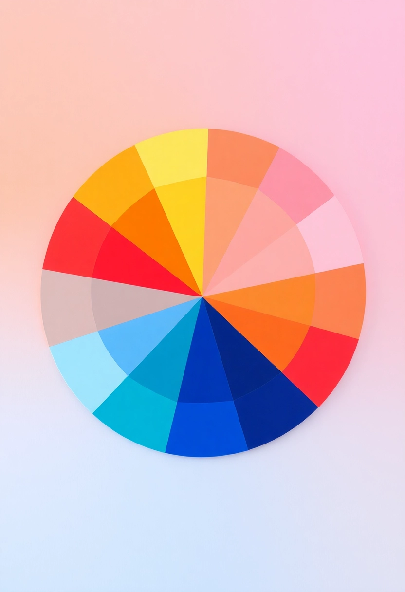
Before diving into the world of color palettes, it’s essential to grasp the basics of color theory. At its core, color theory is a set of guidelines that artists and designers use to communicate with color. It involves understanding the color wheel, color harmony, and the context in which colors are used. #### The Color Wheel The color wheel is a visual representation of colors arranged according to their chromatic relationship. It consists of primary colors (red, blue, yellow), secondary colors (green, orange, purple), and tertiary colors (a mix of primary and secondary colors). Understanding the color wheel is crucial because it helps you see how colors relate to one another. #### Color Harmony Color harmony refers to the aesthetically pleasing arrangement of colors. Harmonious color combinations create a sense of order and balance. Some common types of color harmony include: – Complementary Colors: These are colors located opposite each other on the color wheel. They create a high contrast and vibrant look, perfect for making elements stand out. – Analogous Colors: These are colors that are next to each other on the color wheel. They usually match well and create serene and comfortable designs. – Triadic Colors: This scheme uses three colors that are evenly spaced around the color wheel. It offers a vibrant look while retaining balance and harmony. – Monochromatic Colors: This scheme uses variations in lightness and saturation of a single color. It’s a clean and elegant choice.
Identifying Your Purpose and Audience

Before selecting a color palette, it’s crucial to identify the purpose of your project and the audience you’re targeting. Different colors can evoke different emotions and reactions, so understanding your goals will guide your choices. #### Purpose Are you designing a website, creating a brand identity, or redecorating a room? Each purpose may require a different approach to color selection. For instance, a website for a financial institution might use blues and greens to convey trust and stability, while a children’s toy brand might use bright, playful colors to attract attention. #### Audience Consider who will be interacting with your design. Different demographics may have varying preferences and cultural associations with colors. For example, while white is often associated with purity in Western cultures, it can symbolize mourning in some Eastern cultures. Understanding your audience’s cultural background and preferences can help you choose colors that resonate with them.
Exploring Color Psychology

Color psychology is the study of how colors affect perceptions and behaviors. It’s a fascinating field that can provide valuable insights when choosing a color palette. #### Emotional Impact of Colors – Red: Often associated with passion, excitement, and urgency. It can increase heart rate and create a sense of urgency, making it a popular choice for call-to-action buttons. – Blue: Known for its calming and serene qualities. It’s often used by brands that want to convey trust and dependability. – Green: Symbolizes nature, growth, and health. It’s a popular choice for eco-friendly and health-related brands. – Yellow: Represents happiness, optimism, and warmth. It can grab attention and is often used to evoke a sense of cheerfulness. – Purple: Associated with luxury, creativity, and wisdom. It’s often used in beauty and high-end products. – Black: Conveys sophistication, elegance, and power. It’s a classic choice for luxury brands. – White: Represents purity, simplicity, and cleanliness. It’s often used in minimalist designs.
Tools and Resources for Choosing a Color Palette

Thanks to technology, there are numerous tools and resources available to help you choose the perfect color palette. Here are a few popular ones: #### Online Color Palette Generators – Adobe Color: This tool allows you to create color schemes based on color harmony rules. You can also explore color themes created by other users. – Coolors: A fast and easy-to-use color scheme generator that lets you explore different palettes and adjust them to your liking. – Canva Color Palette Generator: Upload an image, and this tool will generate a color palette based on the colors in the image. #### Mobile Apps – Pantone Studio: This app lets you explore the Pantone color library and create custom palettes. It’s a great tool for designers who need to match colors accurately. – ColorSnap by Sherwin-Williams: A handy app for those looking to paint their space. It allows you to match colors from photos and explore different paint options.
Testing and Refining Your Palette

Once you’ve chosen a color palette, it’s essential to test it in the context of your project. Colors can look different depending on the medium, lighting, and surrounding colors. #### Create Mockups If you’re designing a website or app, create mockups to see how your color palette looks in action. This will help you identify any issues with contrast, readability, or overall aesthetics. #### Gather Feedback Don’t hesitate to gather feedback from others. Sometimes, a fresh pair of eyes can spot issues you might have missed. Share your designs with colleagues, friends, or even potential users to get their input. #### Make Adjustments Based on your testing and feedback, be prepared to make adjustments. Sometimes, a slight tweak in hue or saturation can make a significant difference in the overall look and feel of your design.
Staying Updated with Color Trends

Color trends can influence how your design is perceived. While it’s essential to choose colors that align with your brand and purpose, staying updated with current trends can give your design a modern and fresh look. #### Pantone Color of the Year Each year, Pantone announces a Color of the Year, which often influences design trends across various industries. Keeping an eye on this can provide inspiration and insight into popular color choices. #### Industry-Specific Trends Different industries may have their own color trends. For example, tech companies might lean towards sleek, modern colors, while fashion brands might experiment with bold, vibrant hues. Researching trends within your industry can help you make informed decisions.
Conclusion: Embrace the Power of Color
Choosing the perfect color palette is both an art and a science. It requires an understanding of color theory, psychology, and trends, as well as a deep awareness of your project’s purpose and audience. By following the guidelines in this ultimate guide, you’ll be well-equipped to make color choices that enhance your designs and resonate with your audience. Remember, color is a powerful tool that can transform your work and evoke emotions. So, embrace the power of color, experiment with different palettes, and most importantly, have fun with it! Whether you’re creating a brand, designing a website, or redecorating your home, the right color palette can make all the difference. Happy coloring!

